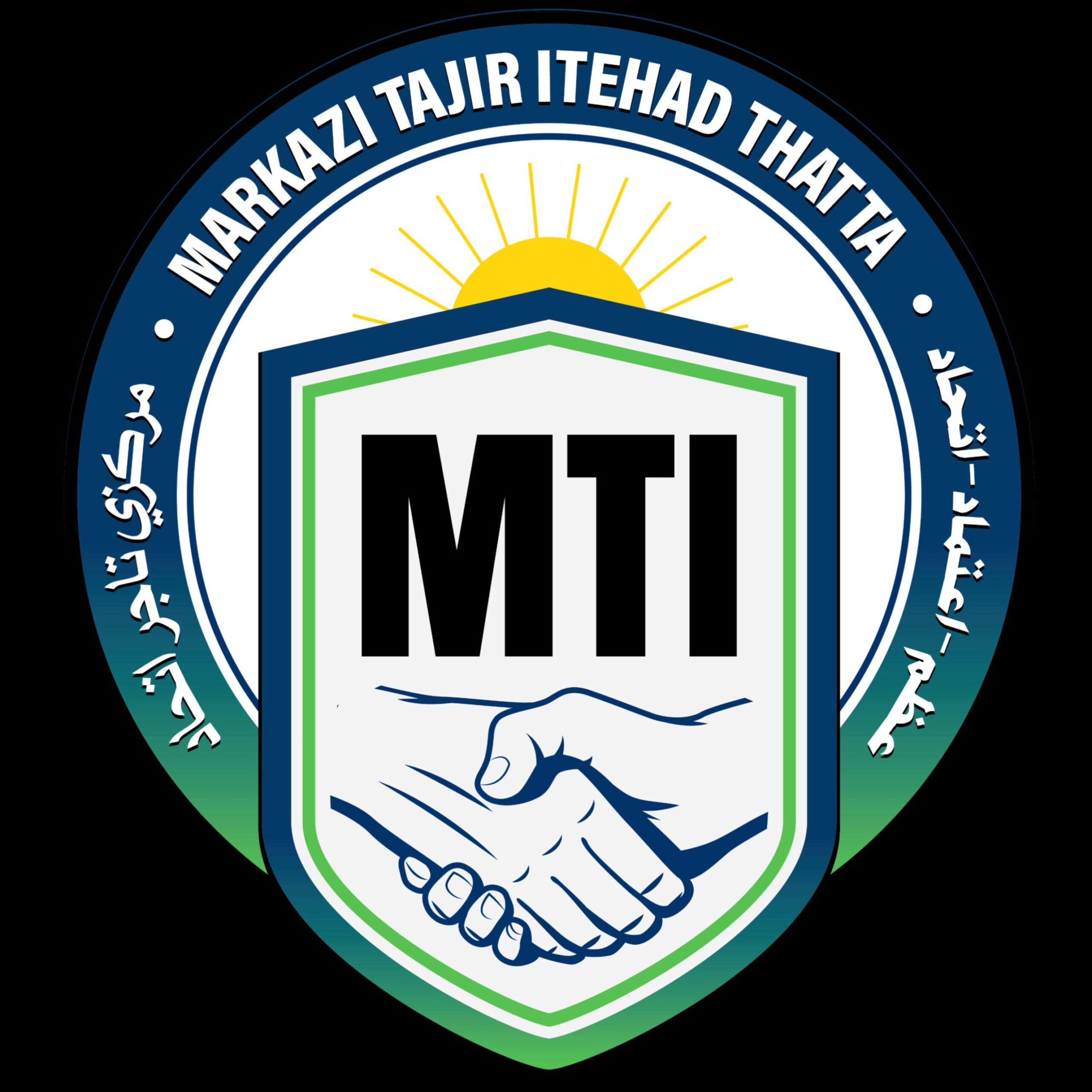
The Story Behind Our Logo – Markazi Tajir Itehad Thatta (MTI) A logo is never just an image; it is a story, a promise, and an identity. The emblem of Markazi Tajir Itehad Thatta (MTI) is more than a symbol; it carries the history, sacrifices, and aspirations of the traders of Thatta, Every shape, every line, and every color tells a tale of unity, trust, and progress. Let us take you on a journey through the heart of this emblem:
ہمارے لوگو کی مکمل کہانی اردو میں پڑھنے کے لیے یہاں کلک کریں
1. The Circle is a Symbol of Unity and Continuity
The perfect circle represents wholeness and community, like a circle has no beginning and no end, our bond as traders remains unbreakable and every trader, larger businessman or small businessman, belongs within this circle; none are left outside.
Essence: Brotherhood and inclusiveness.
2. The Outer Band of Three Languages, One Voice
The deep blue and green band carries our name and slogan in English, Urdu, and Sindhi.
- English: For global identity.
- Urdu: For national unity.
- Sindhi: For regional pride and culture.
This trilingual presence shows respect for every language, faith, and community.
Essence: Dignity for all identities.
3. The Rising Sun is Hope and a New Dawn
Above the shield, the golden sun rises, spreading rays of hope, energy, and prosperity.
Essence: A promise of progress and a brighter future.
4. The Shield is Protection and Strength
At the heart of the logo lies a shield, a mark of security and courage. It reflects MTI’s role as a guardian of traders’ rights, ensuring safety, dignity, and strength.
Essence: Protection, trust, and confidence.
5. The Handshakes are Partnership and Loyalty
Inside the shield, two hands meet in a firm handshake, symbolizing unity, trust, and mutual support. This reminds every member that no trader stands alone — we are all partners in success.
Essence: Trust, cooperation, and solidarity.
6. The Bold Letters MTI
Above the handshake, the bold initials MTI shine with pride. It is a strong, simple, and lasting identity for the organization.
Essence: Recognition and pride.
7. The Language of Colors, which is used
- Blue: Trust, dignity, stability
- Green: Growth, prosperity, hope
- White: Honesty and transparency
- Golden Sun: Energy, light, and new beginnings
- Black: Strength and permanence
Together, these colors narrate a story of trust, unity, and progress.
8. The Clean Design is Discipline and Structure
The sharp lines and defined borders give MTI an institutional look, reminding us that we are not just a union, but an organized, disciplined body safeguarding traders’ rights.
Essence: Order, stability, and credibility.
Conclusion
This logo is not a mere design; it is a legacy, a vow, and a dream. It represents the unity of Thatta’s traders, the protection of their rights, and the collective vision of growth and prosperity. Every time we see it, we are reminded that we belong to a larger family — shielded by protection, enlightened by hope, and strengthened by unity.
Written by Abdul Bhai – President, Markazi Tajir Itehad Thatta.

Pingback: ہمارے لوگو مرکزی تاجر اتحاد ٹھٹہ کی کہانی - Markazi Tajir Itehad Thatta